I’m even more lost doing this than I was with flexbox. So I’m just gonna breeze through this and learn how it applies when it comes time for the project. I’ll still show you the right answers, but take the explanations with a grain of salt; I’m still learning just like you are.
display: grid;
This allows us to use all properties associated with CSS Grid.
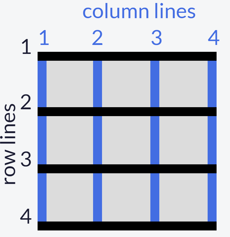
Then we define the structure of the grid; we’ll start with grid-template-columns.
grid-template-columns: 100px 100px 100px
Each unit (we have 3 here) you add is the amount of columns that the grid will entail
The same goes for grid-template-rows.
The values for these row/column templates are, fr (fraction of the remaining row/column; can be any whole number), auto (automatically adjusts to the width/height of the grid), and % (adjusts column/row to the percent width of its container).
You can create a gap between columns with the grid-column-gap. The value is any unit of px.
And once again, the same goes for grid-row-gap.
We also can do an abbreviation of this with grid-gap. You’d only use this if you want to space all the rows/columns. If you put 2 values, it will adjust the rows and columns, in that order.
Using the grid-column element, we can use a fractioned value to make an item extend. So for this task, I used 2/4 to make the item extend from column 2 to column 4. grid-row applies too.
Next we can align an item horizontally (justify-self) and vertically (align-self). The 3 values are: start (left/top), center (middle), and end (right/bottom).
You can also align all items as compared to single ones like we just did. Just replace ‘self’ with ‘items’. The same 3 values still apply.
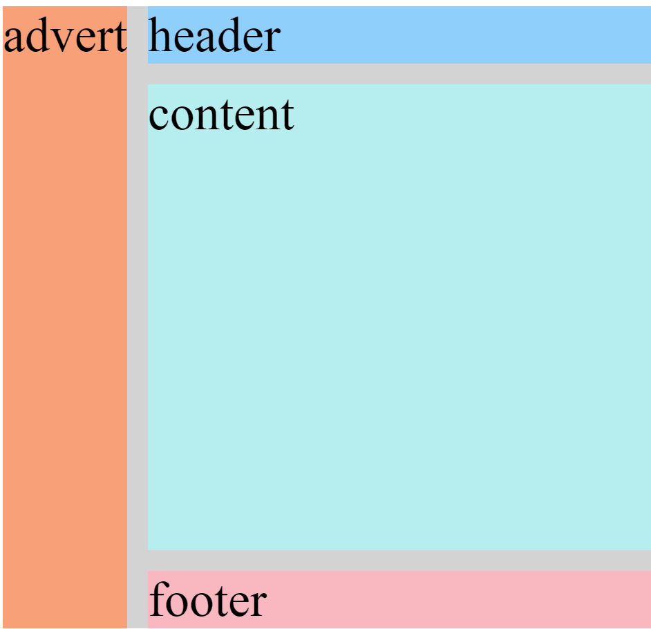
Creating an area template for our grid basically allows us to play with it a little more manually, as compared to doing separate commands for every little thing.
Based on a 3×3 grid, each of these values represents a box within the grid. So the “header header header” represents the top 3 boxes, “advert” is the middle row’s left while “content content” is the middle row’s middle and right boxes, and “footer footer footer” encapsulates the entire bottom row.
Under whichever class you choose, you can use grid-area to reposition the item into any value. Going off of the above code, if I set the value to footer, the class’s item would then take up the whole bottom row.
In the event there is no area template available, we can use the line numbers alternative:
grid area: A/B/C/D
A: horizontal start point/B: vertical start point/C: horizontal end point/D: vertical end point
So if you wanted the item to start from row 1 and end at row 2, and also start from column 3 and end at column 4, you would write it as 1/3/2/4
This whole time we’ve been adjusting a 3×3grid, as we go on, we’ll see the grids in the real world are way bigger than that. As compared to the grid-templates where we write a unit for each row/column, we can use the repeat function to select multiple rows/columns instead of writing in the unit for each one. This only works if you want the unit to be equal between all selections; it doesn’t work if you want 22px for one and 54px for another.
grid-template-columns: 2fr 2fr 2fr 2fr;

to

grid-template columns: repeat(4, 2fr);
This keeps our code clean from a bunch of redundant units.
To limit items’ sizes when the containerchangessize
grid-template-columns: repeat(3, 1fr);


to

grid-template-columns: repeat(3, minmax(90px, 1fr));
The units in the ‘minmax’ function are the specified minimum and maximum widths of the column.
Still barely know what I’m doing, we’re almost done.
Adding auto-fill to a repeat function (supposedly) adjusts the items to fit the container to leave space for newer items
Auto-fit on the other hand seems like it only adjusts the items’ sizes to fit the container itself; so I guess this is for when you don’t plan on adding any more.
FINALLY, we can create a grid within a grid. Under your selected class, you first add the display grid property (the first code in this post) and then use either of the templates we went over.
What I Learned Today
To first define a grid to be able to adjust it
Define the structure of grid rows/columns (values: fr, auto, %)
Create a gap between rows/columns
Extend a grid item using a fractioned value
Align an item horizontally/vertically
Align all items horizontally/vertically
Create a grid area template
Reposition an item in a grid area
Use line numbers as an alternative for an absent grid template
Use the ‘repeat’ function to avoid writing the same unit over & over again
Limit items’ sizes for when the container changes size with ‘minmax’ function
Use ‘auto-fit’ and ‘auto-fill’ to adjust items’ size within the container
Create a grid within a grid
Concerns
For #7: When assigning a value to the grid area, why does only one take up the whole row? Why is it when I only put one ‘footer’, it doesn’t do one box if the template area has 3? Shouldn’t it be like ‘footer footer footer’ if I want the whole row?
Finally done the basics! I’m almost certain that these grids are just a way of manually adjusting site content; basically the technical way of putting together a site compared to drag-and-drop.
Next up I’ll be doing the first project, a tribute page.
So as of now it seems like adding this code will basically align the content in the tweet. I don’t know how it does that, but I just see that it does.
flex-direction: row;
Keep in mind that ‘row’ is the default value of flex-direction. You could also use ‘column’, ‘row-reverse’, or ‘column-reverse’ too.
When all the flex items don’t fit in a flex container, we can use the justify-content element and its array of values including: center, flex-start, flex-end, space-between, space-around, space-evenly.
Don’t overthink the function of all of these values, just use your basic (Western) intuition of our progression moving left to right; so flex-start would align everything left and flex-end would align it right. You should get the picture by now, you can play with these values on your own project.
The previous tasks were all dealing with the main axis of a flexbox. This next one is dealing with the cross axis, which is basically the opposite of everything main axis does.
So the ‘justify-content’ of cross axis is align-items. It has some of the same values, like center and flex-end, but it has two new ones, stretch (the default value, just how ‘row’ is for flex-direction’) and balance.
Since align-items is the technical opposite, that means while flex-end would originally align right, it now aligns down.
Next we have wrap property. The element ‘flex-wrap’ wraps items onto multiple lines from top-to-bottom if they are in rows and left-to-right if they are in columns. The values are ‘nowrap’ (default), ‘wrap’ and ‘wrap-reverse’
Flex-shrink does exactly what it says. The values are single numbers, but they are relative. So if one flex-shrink is 1, and the other is 3, the one with 3 will shrink 3x as much as the first one. So order is prioritized in these values. The same goes for flex-grow.
Flex-basis is what technically should’ve been first. This is what sets the initial size of an item before we adjust it. You can use the px, em, or % units. ‘Auto’ will size the item based on the content.
To put it all together, we can use an abbreviated version of the flex element.
flex: 1 5 200px
The order of these numbers is, grow, shrink, and basis. So this example has a flex-grow of 1, flex-shrink of 5, and flex-basis of 200px.
We can also rearrange the order with a self-explained element
order: 1
Just order them however you wish.
Lastly, there’s align-self. This takes all the same values as align-items and will also override and align-items properties.
What I Learned Today
Flex-direction
Justify-content
Align-items
Flex-shrink/grow
Flex-basis
Align-self
Concerns
So I have ZERO idea of what a flex item is. I don’t see how it’s any different from regular CSS graphics. It started off with Tweets, then moved onto complex graphics.
I’m doing CSS Grid next, which ties into flex, so hopefully it’ll tie together at the end of that.
We’re past halfway there yall! I’m starting off on the Web Design Principles, after this we only got the CSS Flexbox and Grid left, then we can start the projects! 😁
Media Queries
So of course we don’t all use the internet on the exact same device. So just like we did with Applied Accessibility, we have to modify our site to make it accessible to different media types.
The first that likely comes to mind is font. Digital screens are made up of pixels, but the pixels vary by the size of the screen; 10px on an iPhone is different from 10px on a desktop. The visible area a user can see on a webpage is called the viewport. This isn’t the same as resolution, which is moreso the quality of the screen’s projection. The viewport is the screen’s fixed size.
So our first task is to modify the font size so it adjusts to a smaller screen.
<style>
p {font-size: 20px;}
@media (max-height: 800px){ p {font-size: 10px;} }
</style>
You can also change the max-height to minimum or width. Just keep in my whether you’re specifying the minimum or maximum, that means the content will alter when the screen is more than or less than (in that same order as min & max).
So this code commands the font to decrease from 20px to 10px if the user’s screen height is less than 800px.
Image Responsiveness
This is basically the same as we did with font, just with images.
So this got a little confusing, cause the instructions said to put the rules within the ‘responsive-img’ element (which was declared in an ‘img src’ element below that I left out), yet that was wrong. I pasted this correct answer from the module, and the ‘responsive-img’ element is left blank, so I don’t see why it’s there in the first place.
But yea, this is how you modify an image to be responsive to a change in screen size. This particular example ensures the image’s width will always fit the screen while the auto-height preserves its original size. If you were to do 100% or auto for both, it would still be stretched out and low resolution.
Retina Image for Higher Resolution Displays
Jumping back to viewports and resolutions, sometimes an image can only be as clear as its digital creator made its resolution; a high-res screen doesn’t automatically make every image clear, the image has its own res too.
This gets technical very quickly, so we’re gonna stick with the simple method for now: Redefine the height and width as half of their original size.
This example is based on an image that is 200×200. Of course you can adjust this for whatever your image’s size is, just make it half.
Instead of using fixed units like pixels, we can set them to be relative to the viewpoint’s dimensions.
We just use the 4 dimensional units, width (vw), height (vh), maximum (vmax), and minimum (vmin). This is technically just an alternative for percentages, so any number you put in front of these units will be a percentage of the viewpoint’s size. So 10vw is 10% of the viewpoint’s width, and 35vmin would be 35% of the viewpoint’s smaller dimension.
What I Learned Today
Use a media query to adjust font size for various screen sizes
Make an image responsive to change in screen size
Shrink a low-res image to appear clearer on a high-res screen
Adjust typography/font responsiveness using relative viewpoint units
Concerns
This was surprisingly easy 😂 every time I skimmed through this module in the curriculum I thought each of these were projects in themselves. I’m glad these were simple enough to breeze through.
Next we’ll be going over CSS Flexbox, which looks like it’ll be a more nuanced look into the graphical boxes we’ve been over.
We of course have to consider our disabled peers. Not everyone can see or hear the content we come across, so we provide alternatives.
The first obvious task is images. When the visually impaired can’t make out an image, we add a text alternative for their audio screen reader to transcribe.
Just add an alt tag with the description in the quotes.
<img src="anyimage.jpeg" alt="image description">
If the image already has a caption, you can also leave it blank, but still do the quotes.
This next task doesn’t have any special code, but it’s still important.
When the screen reader reads, it acknowledges the visual hierarchy of your text. It describes the heading as what it is, as the same goes for the subheading and paragraphs. Bottom line,keep your headings ordered. No <h1> to <h4> to <h2>.
Screen readers also give users options to jump to sections of the content. You’ve probably seen those ‘jump to main content buttons’, this is just a screen reader’s version of that. This is where HTML5 comes in. Remember, HTML5 doesn’t do anything physically to the page, it’s just for organizing the code. You can add any tag you want, usually main or footer is standard. Just place it in between whatever elements you wish. For a typical ‘main’ tag, you would place it between the header and footer elements.
Within the ‘main’ tag, we also got article and section who serve as a set and subset of content. If your post is a book summary, ‘article’ would be the book and ‘section’ would be the chapters.
There’s also the header tag, which is similar to the main tag. Keep in mind is it not the same as the ‘head’ tag, as in the page’s title.
We also have audio elements as an alternative for the visually impaired who can’t access audio content.
The ‘audio/type’ is only a placeholder for whatever the actual type is, though it will still start with ‘audio/’.
Next we got figure tags. This is basically a more general version of the first task we did with the text alternative. This tag can be used for images, diagrams, charts, or any other visual content.
Its input is a basic <figure> tag, subsetted with a <figcaption> tag for the caption, just make sure you close them. You can wrap the figure tag around any content you desire, and make sure the <figcaption> goes within the figure tag.
We can ensure the screen reader acknowledges forms with a simple ‘for’ attribute.
This example is for creating a name-text-input. The ‘for=’ is the only attribute that specifies for the screen reader. For any other type of form, ensure your ‘for’ is the same as the ‘id’.
When a screen reader approaches a selection form (or radio buttons like we’ve done), we can add fieldset and legend tags so the reader can describe what the user is making the choices on (legend) along with listing the choices themselves (fieldset).
There’s no special code for this. In a form element, replace the ‘fieldset’ tag where the <div> would be, and replace the ‘legend’ where the title of the selection box would be, in most cases that would be the <p> tag.
Next we can add a date picker to a form; you know the little calendar you click so you can pick the date instead of typing it.
The top label is what first defines the input-box. We then use the ‘id’ attribute to apply our little calendar to this box. So the ‘type’ and ‘name’ are for the calendar, and the ‘id’ is what applies it the input-box.
We can use the time element with the datetime attribute to so the screen reader can emphasize it as a date and not just regular text
<time datetime="2016-09-15">Thursday, September 15<sup>th</sup></time>
The <sup> is for the superscript, (likethis) to accent the ‘th’ next to the date number. It’s not mandatory for this code, but it is typical when writing dates.
Screen readeronly elements are written as ‘.sr-only {}’ with the respective attributes underneath it. We’ll come back to this later.
To give the assistive device (still the screen reader) the ability to describe links, we add anchor tags.
<a href="">the text you want to be described</a>
Adding an accesskey makes navigation easier for our disabled peers (think of it as the ‘fast travel’ function in open-world games; you can go straight to your destination without scrolling through the whole page).
It goes within an anchor element:
<a href id="who1" accesskey="w1" href="#"</a>
Once again, this allows the assistive device to point out interactive actions on our site (mainly links & buttons
We can add a tabindex. I don’t have a clear idea what “bring to focus” means yet (I’ve never used a screen reader). All I know is this goes within whatever tag you wish to focus. It’s typically set to 0.
<h1 tabindex="0"</h1>
So 0 is the default order of the tabindex. If you want to order the sections that are focused on, just add 1, 2, 3, and so on.
What I Learned Today
All of these are based on commanding the assistive device/screen reader to do something
Add a text alternative for an image
To keep the visual hierarchy in order
Use HTML5 tags to section content for the ‘jump to’ function (main, footer, article, section, header)
Add an alternative for audio content
Add a figure tag to specify visual content
Along with the <figcaption> tag to describe the content
Ensure the screen reader acknowledges forms
Along with ‘fieldset’ and ‘legend’ tags to describe the choices within the form
Add a date picker (the small calendar icon)
Specify a date with ‘datetime’
Describe a link
Add an ‘accesskey’ for focusing on different sections of the content
Use a ‘tabindex’
Concerns
It seems like accesskey and tabindex are similar to the ‘jump to’ function. I can see how the tabindex keeps it ordered (it shows you 1, then 2, then 0 if nothing else), but the accesskey just seems redundant compared to simply doing a ‘jump to’ in the screen reader.
The datetime seems redundant too. I don’t see how it’s any different from the screen reader simply reading the date.
Today we’ll be going through the Applied Visual Design module in FreeCodeCamp.
At this point, we are assuming all of these elements are wrapped within a style block unless specified otherwise.
For a simple start, let’s look at visual balance.
This is when we want the text to be uniformly aligned, whether it’s left (default), right, or centered.
This would go within the element’s class selector. We’ll say <p> for this example:
p {text-align: center;}
We can also use one called justify which will give the text equal spacing. If your text looks jumbled, add ‘justify’ to your text-align element, and it’ll clean it up for you.
We can bold our text using a strong tag <strong>, just put it at both ends of the text you want bolded. Remember to close it, </strong>
We can also underline with a <u> tag. Same process applies as with the bold.
Italicize with <em>
Add strikethrough text (like this) with <s>
We can add a horizontal line (used for sectioning) with <hr>. This tag closes itself, you only have to use the one.
To build on from rgb background colors, we can also use rgba. The ‘a’ stands for alpha, which is the unit for opacity. Alpha ranges from 0 (transparent/clear) to 1 (opaque/solid). There is no special code for it, just add “a” and an extra number to a typical rgb element.
Here’s something we can use to make our graphics look more intricate. We can use box shadows to give our text cards a more accented look. It basically gives that little black gradient on the sides of the cards.
The box-shadow property takes (numerous) values for:
offset-x (how far to push the shadow horizontally from the element),
offset-y (how far to push the shadow vertically from the element),
blur-radius,
spread-radius and
color
in that order. Blur-radius and spread-radius are optional. So the typical box shadow property looks like:
box-shadow: 0 10px 20px rgba(0,0,0,0.19), 0 6px 6px rgba(0,0,0,0.23);
Even after playing with them in the interpreter, I still don’t see how the numbers correlate to each of those values. I’ll have to come back to this
We can also capitalize text without having to adjust the text itself.
In the text-transform property, you can either put: ‘lowercase‘, ‘UPPERCASE‘, or ‘Capitalize‘. Either value is still inputted in lowercase, but the page text will transform into it’s respective capitalization.
There’s also a font weight value that adjusts the thickness of the font. It ranges from 200-1000, no ‘px’ necessary.
Add a line height value to adjust the spacing between lines. Use with ‘px’.
Next we got the hover selector. This accounts for what a clickable text does when you hover over it. The first task has you add a rule for color so the text will highlight that color when you hover over it.
Remember our buttons are made from anchor elements, so in the code this would look like:
a {
    color: #000;
  }
  a:hover {color: blue;}
The ‘:hover’ property is what makes the text turn blue when the cursor is over it. Otherwise it defaults to black when it is not hovered over.
So remember that all HTML elements are presented as blocks. Even as I type this on WordPress, each paragraph (and code) is in its own box that keeps the visual layout well-spaced and uniform.
So whenever we want to move those boxes, we can add a position property and set its value to relative. We then add any direction (top, bottom, left, right) with its own value of px’s. The relative setting ensures that whatever direction we tell it to go, it will go relative to where the box originally was (usually the top-left corner is default for text on a blank word doc).
position: relative;
top: 15px;
When moving these boxes, it’s important to remember your chosen direction(s) are offsets, meaning the box will go in the opposite of the chosen direction. Imagine that whatever direction you input, say ‘bottom’, the computer is being told that the box has lost space at the bottom, which will make it go up.
In a nutshell, if you want to move the box up, you would space it from inputting ‘bottom’. If you want to move the box right, you’d space it from inputting ‘left’.
Next we got absolute positions. It’s the same process as we did with relative, except with absolute, this will force an element to be locked into its parent element. So if I wanted to move my paragraph <p> box with an absolute position, that means that whatever direction I tell it to go, it will be within range of its parent element, in this case that would be the heading <h1>.
There’s also another type of absolute position called fixed. It’s exactly what it sounds like, this fixes the box into one position so it will not move when the user scrolls the page.
So this next tasks shows float as a similar positioning property. First, mind that this does not require a position property, float is its own thing. Float can only go left or right relative to its parent element. I didn’t bold ‘relative’ because the task doesn’t define it as a relative property, even though it serves the same function as far as I see.
This looks kinda janky for a basic webpage, but if for some reason you ever want to stack boxes on top of each other (I’d hope you be doing this for graphics and not text), you can use the z-index property which adjusts the stacking order of your boxes. These have to be whole numbers (usually lower like 2 or 3 unless you page is ridiculously layered). In general, starting from a basic page, adding a z-index of 2 to a box will overlap it over another box.
This task was a little random, but you can center a box by inputting the margin property and setting it to ‘auto’, since center is the default position for a margin.
Moving onto colors. There are 3 grades of colors: hue (spectrum of color, red-to-blue), saturation (amount of gray in a color,the lower the sat, the more gray), and lightness (amount of white).
This property is styled as hsl() with the 3 grades’ numbers listed in that order, latter 2 are percentages. So a color with 300 hue, 100% saturation and 50% lightness would look like:
hsl(300, 100%, 50%)
This is the hue command for the color green.
Next we can add gradient colors to a background. After adding ‘linear-gradient’ to the background property it is followed with the degree (direction the colors fade) and the colors you want to be gradient.
I can tell this gets messy when doing a flashy page, especially if it requires a lot of pastel colors.
You can also turn the gradient into stripesby using the ‘repeated-linear-gradient’ property. You’ll have to play with the colors to get your desired result, but it’s pretty much the same process.
We can use the scale value with the transform property that allows us to resize a graphic. Any number (including) decimals will suffice.
Back to the hover selector, we can also set its value to enlarge a box when hovered over, whether text or image.
Task has you apply it to a div graphic, so I’ll just paste it:
div:hover {transform: scale(1.1)};
We can skew elements (still boxes) along the x or y-axis with:
transform: skewX(25deg);
For a graphic square, this would turn it into a parallelogram. And of course you can replace X with Y, make sure it’s capital though.
Next we’re moving on to animation.
Within an id element (the task has me using #rect), we first input the animation name and duration.
Another hover option, we can make a button change color when hovered over.
This may seem similar to the hover element we did earlier in this post. This method makes your colors more fluid (fade in/out) instead of a hard change.
We first specify a button hover element with the animation properties nested inside of it.
I copied and pasted this straight from the task. Notice it has the name ‘background-color’ so we know what the hover is changing. Notice the duration is in milliseconds (ms), to which 500 is half of a whole second.
We then do our keyframe element just how we did before.
The 100% here ensures the button will fully highlight when hovered over. Lower percentages are more like a blink.
This feels anal, but adding the hover element this way only temporarily highlights the button. If you want the button to stay highlighted, we do an ‘animation-fill-mode’ element.
animation-fill-mode: forwards;
Specifically the ‘forwards’ is what keeps the button highlighted.
Making the animation move in different directions isn’t anything more than what you would think it is. We just add multiple directions within the percentages.
We can also make the animation fade with opacity, just input it as a regular property. Remember opacity ranges from 0-1, so your numbers will have to be a decimal.
Unless you want it to never stop moving, we can choose how many times the animation will loop. This is called the animation-iteration-count. This can be any whole number you choose, or you can even set it to ‘infinite’ by simply inputting that word.
For a variety of smoother motions (say animating a ball to slow down as it reaches its peak in the air), we can use ‘animation-timing-function‘. As of now, the only keywords introduced are ‘linear’ and ‘ease-out’.
One special property of the ‘animation-timing-function’ is the cubic-bezier. This is based on a 4-point coordinate system (x1, y1, x2, y2) that gives us manual control over the movement of the animation. The points are between 0-1, so again, your numbers would be decimals.
This content is based on the book ‘CODE’ by Charles Petzold.
Modern number system is derived from the Hindu-Arabic. Developed by Indians, but presented by Arabics to the Europeans.
It’s positional (per the book, I like ‘linear’ better), where the numbers are in a digit matter just as much as what they are. Obviously 4023 isn’t the same number as 3240.
It doesn’t have a special symbol for 10, like other number systems. This gives it the simpler alternate names of ‘base-ten’ or just ‘decimal’.
But is uniquely the only system to have 0.
10 is our sacred ‘whole’ number, which our fingers and toes made convenient.
One alternate number system is octal, or ‘base-8’. Some ancient civilizations used this system given they would count either their knuckles or the spaces between their fingers.
This weird system believes in counting: 0, 1, 2, 3, 4, 5, 6, 7.
Yes. 8 and 9 do not exist in the octal system.
I’m seeing that this isn’t commonly used today, compared to the binary (base-2) and hexadecimal (base-16) systems, but I’ll still learn its basics for the sake of getting used to a new system.
8 in regular decimal (written as 8TEN) = 10 in octal (written as 10EIGHT)
Remember, there are no 8’s or 9’s in octal. It gets tricky once we go up.
15TEN = 17EIGHT
16TEN = 20EIGHT
18TEN = 22EIGHT
23TEN = 27EIGHT
24TEN = 30EIGHT
If you got a high-10s number, it’s much easier to just go through your multiples of 8.
8TEN = 10EIGHT
16TEN = 20EIGHT
24TEN = 30EIGHT
32TEN = 40EIGHT
40TEN = 50EIGHT
And so on.
Binary
This should be a little more comfortable. Not ‘easier’, just more familiar since this is used more in computer science.
To refresh, ‘bi-‘ means 2, so binary is based on 2 digits (hence ‘base-2’), 0 and 1.
Starting off, 1TEN = 1BI
2TEN = 10BI
3TEN = 11BI
4TEN = 100BI
So each binary number will either end in 0, 1, 10, or 11.
The digit format for binary code
Binary can also be used for alphabetical letters too, but we’ll cross that bridge when we come to it. Try using the digit structure to find the binary counterparts to decimal numbers.
In tech jargon, the word ‘bit’ is used to mean a binary digit, or more broadly, a basic building block of information. Bits are the smallest (in size, not importance) unit of information.
“Information represents a choice between two or more possibilities“
The rest of the chapter takes you through a variety of devices that use ‘bit’ information. Using lanterns, movie ratings, film speeds, and barcodes, the ultimate purpose of a bit is to convey information in as small a unit as possible.
For UPC barcodes, the information is represented by vertical lines that vary by width and the space between the lines. UPC doesn’t have a cut-and-paste formula like other bits, yet its visual representation looks similar to morse code.
What I Learned Today
Octal number system
Binary number system (basics)
What a ‘bit’ is and a few examples of how it plays out in real-life devices
I know I glazed over a lot when it came to explaining the bits and how to count them when it comes to longer series (one line on a UPC barcode could represent a 7-digit binary number), but I’m glad I got a basic overview of how these numbers systems work. Binary looks exhausting as the numbers get higher, but I’ll have to get used to it if I plan on working with computers. I should probably start memorizing its formula so I can instantly translate a decimal into its binary counterpart.
This is the only concept I go over in this post. The second half is my struggle with probability as a subject.
When flipping a coin, the probability of me flipping a head is 50%, or 1/2
Every… single… time we flip a coin, it is a completely independent event.
A coin never thinks, “Hmmm, I’ve been landing on tails a lot, so I’ll make sure to land on heads next time”.
So us predicting the next flip is a single event.
Now if we want to predict multiple independent events, we use the rule of product.
So if my chance of flipping heads on the first flip is 1/2 (I hate fractions with a passion, but I admit they’re easier for this), the chance of us flipping two heads in a row would be 1/4.
To take it further, our chance of flipping three heads ina row would be 1/8
So for every independent event you add to the trial, you double your chances of it happening consecutively.
What’s the Chance I Wouldn’t Care About Chance?
Alright, I’ve done 3 different ‘intro to probability’ courses and I’m still lost on what exactly this is used for.
Moreso, I don’t see how precise probability applies to the real world outside of gambling and machine learning.
No really, for everyday things like weather, we only care about more or less likely (over or under 50%). Past that, nobody goes about doing a bunch of calculations just to find out if something will happen or not.
In what possible scenario is telling me “You have a 72.841% chance of this working” any more helpful than simply saying “You are more likely to succeed at this”?
Or like in those action/sci-fi movies where the nerd scientist will say “The odds of this working are 88,256,373 to 1!!!” while all theother characters ignore him and still succeed at the challenge they were facing. What was the point in doing all that calculating instead of just saying that this is closer to possible or impossible?
This is only increasing my frustration because I have to learn this for machine learning, yet I don’t know where to start learning probability without jumping straight into the complex. Even the two statistics college classes I took barely scratched the surface of probability. Like I said, once you get past coin flips and dice rolls, you go straight into Greek letters and tangled equations.
So, I now have no other choice but to learn this through casino games. This is the simplest field I can start with that doesn’t require as much calculating as other fields like medicine or insurance.
So in my next post, I will be starting with two basic casino games and deconstructing their probabilities. They may be different once I actually post it, but as of now, I’m thinking blackjack and dice will be my first victims, given their simplicity.
CSS (Cascading Style Sheets) is the language used for aesthetic purposes in creating a document, typically paired with HTML. HTML is the coloring book. CSS is your crayons.
We mainly use it for fonts, colors, and graphic borders.
There are 44 tasks. I’d like to finish this today, or at least get 30 done. So let’s get started.
First, we will learn how to change the color of a text.
The first thing we want to do is to take the closing angle bracket > off of the opening tag of the element we want to do.
So let’s say I want to change the color of my header, we’ll use the text “Title” as a placeholder.
Remember, originally, a basic header text would look like:
<h1>Title</h1>
If I want to change the color of this header (say to blue) I would do:
<h1 style="color:blue;"Title></h1>
See how I removed the closing angle bracket off of the first h1 tag and moved it to the end of the text?
It’s important to mind the colon after color and the semicolon after the name of the color.
I can already see how that would get messy, especially for a flashy page. I prefer to use the CSS selectors
So instead of adding the color within the code, I’ll just wrap the code around a style block.
<style><h1 {color: blue;}</style>
<h1>Title</h1>
This code performs the exact same function as the previous code. This way takes up more lines, but it’ll be easier to look at as the code gets more clunky.
Remember, most code we write isn’t set in stone after we finish. We have to structure it so it is accessible for other programmers to revise.
This next one also does the same thing as the previous two codes. It’s not simpler, so I can’t yet say its purpose besides just seeing it as another alternative.
Scratch that on me saying I don’t see the purposes of classes. These are better for selecting elements individually, as opposed to the style blocks that would have to go over every element I want colored.
This is a great opportunity to look at how there are multiple ways of writing the same code, yet some are more appropriate than others depending on the programmer’s goals.
If there is only one line I want to be colored, the first code would suffice.
If I want to color multiple blocks of text that are all next to each other (say “heading on line 1, second heading on line 2, and paragraph on line 3”), the second code of style blocks would be appropriate for that.
The last code that I just wrote is for selecting elements individually. If I want to color the elements on lines 2, 4, and 10 without coloring those in between, it would be cleaner if I defined the class first, then just add the class to the lines that need it.
Now, let’s move on to font size. This goes within a style block.
<style>
h1 {font-size: 20px;}
</style>
The ‘px’ (pixels) is the unit for font size, the number before it can be whatever you please. Just like how it is for colors, don’t forget your colon and semicolon.
Here’s font families (or names).
<style>
p{font-family: fontname;}
</style>
You can also pair these elements within the same brackets
<style>
p {font size: 20px;font-family: fontname;}
</style>
We can import from Google Fonts. You first paste the link at the top of the page:
Personally, I would prefer to put a comma between the classes to keep it clean, but the comma invalidates the code. So we’ll have to pay close attention to those spaces and not get the classes jumbled.
To make our borders a little more boujie, we can give them rounded corners.
By adding this into the opening tag, the class will be applied to everything within the element.
Next we can add idelements. This similarly performs the same function from the 3 ‘color blue’ commands I broke down, which is specifying classes. But the major difference with id elements is they can only be used once.
So after putting an id inside of an element:
id="text-text"
We can then declare it in the style element which will change the graphic for us. Let’s say for this example we want to give it a red background
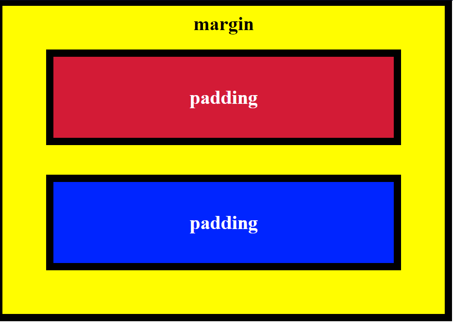
Thankfully, this doesn’t have to be as tedious as writing down each individual side. We can simply put the numbers all inside of one padding or margin element.
<style>
.blue-box {
background-color: blue;
color: #fff;
padding: 20px 40px 40px 20px;
margin: 20px 30px 30px 20px;
}
</style>
While I said that the order of naming the sides doesn’t matter, if you want to use these numbers by themselves, they’re in the order of top-right-bottom-left.
For certain HTML elements (the checkboxes in this example), we can simply use a class selector to style our elements
<style>
[type:'checkbox'] {margin: 15px 5px 20px 5px}
</style>
So this whole time we’ve been using pixels (px) as our units. This is an absolute unit. If you look extra close at a screen, and you see all the little pixels/dots that make up the whole picture, absolute units go strictly off of how many of those pixels it will take up. This varies by the screen size, but for the most part they stay the same.
Now we’re going to start using a relative unit (em) whose sizes are relative to the font size used. If my font size is 10px and I set it inside of a (graphical) element with padding, that padding will squeeze to fit the exact font size.
This is an element with no em:
This one has 1em:
And this one has 2em:
See how the padding doubles relative to the font?
Since we can override styles with classes and id’s, it’s good form to add an !important in the primary style you want shown.
.red-text {color: red !important;}
This will ensure that red will be the primary color for the selected element over other colors that may be declared
Instead of using the names of colors, we can get more precise and use the hexadecimal (base-16) code. The hexadecimal number system is based on 16 digits as compared to 10 in our regular decimal system.
So hexadecimal has the regular 0-9 digits, with ABCDEF representing 10-15.
Since we know that black is essentially the absence of color, that means black would be #000000, while white (who’s a mix of all colors) will constrast as #FFFFFF
Outside of the hash followed by 6 digits, there is no extra special way of inputting this code.
<style>
body {background-color: #000000}
</style>
Hexadecimal’s color structure follows RGB (red, green, blue) with each 2 digits representing the color.
So all red would be #FF0000. Or rich purple (shows up as more of a magenta) could be #FF00FF, since it’s red and blue turned to the max.
The six-digit system gives us a possibile 16 million different color combinations. Unless you’re programming something extra artsy, that won’t be necessary. So we can simplify this system with 3 digits, one for each color and 4,000 possible combinations.
An alternative to this system is using the RGB values as it’s own element. The code below shows the command for black and white just like my first example with hexadecimal.
rgb(0, 0, 0) or rgb(255, 255, 255)
Coming to a close, we’ll be going over variables.
After looking through forums, I still have no idea how variables are any different from classes, we’ll just go over it for now.
A variable is defined with two dashes in front of the name. For the sake of example, we’ll stick with colors.
<style>
--variable-name: black;
</style>
And of course we can add a fallback color in case the variable’s is unavailable. Just add the color within the element and separate it from the variable with a comma.
Today We Learned How To
Change text color
3 ways to do a style element for various circumstances using classes and selectors
Set font size
Adjust font families/names
Import from GoogleFonts
Specify a downgrade/backup font
Resize an image
Add borders around an image
Adjust the borders around an image (color, width, style, radius)
Add background color to a text
Add an id element
Adjust padding, border and margin of an element (color & size)
Use relative units, as compared to absolute
Specify colors using hexadecimal
Specify colors using RGB
It was great to get a refresher on all of this. I got exactly what I wanted, to build momentum.
Concerns
Only what sets a variable apart from classes or selectors. I should pick this up in the near future.
At first, I said in my study intro that probability is harder than statistics since there aren’t any formulas at your disposal. Turns out there are some formulas, but you have to adjust them for each problem. Probability isn’t as plug-and-play as other branches of math. Of course if it was then we could practically predict the future, which somebody would have found by now.
It’s already hard to talk math. With probability being the most intuitive branch, it’s almost impossible to verbalize. I pity those taking this subject in formal settings where all of the worksheets are strictly numbers with little guidance on interpreting them
I’ve found this site that allows the student to approach probability from an interactive standpoint; funny how a form of teaching that actually engages the student is seen as unorthodox.
So I’ll go through this site’s path and do the best I can with the concepts. I won’t get too into details, this is just an overview of probability.
Chance Events
To start off, probability is an attempt to measure the likeliness of an event. I was wondering if there’s a difference between this and likelihood. Google says the former is general while the latter is specific. We’ll come back to this later
As we all know, the likelihood of a coin landing on either side is 50%.
What we need to consider is that this number is based on a large trial. Theoretically, if you flip a coin 100 times, it each side should win 50 times. Keyword: theoretically. There are few situations where we conduct a trial 100 times, so I don’t see how 50% is really anything more than an educated guess.
Expectation
I’m assuming this is the same as expected value. The site is defining it as long-run average and probability-weighted sum. I won’t overthink these terms for now, so we’ll go with expected value.
This is our attempt to find the center of a random variable’s distribution. The site uses a 6-sided die, claiming that the expected value should be 3.5.
As of now, this sounds like a more detailed version of chance events. It’s basically saying that if you roll the die a large number of times, 3.5 should be the average of all the numbers you get.
They give you a formula, but we couldn’t even try to unpack it as beginners, so we’ll come back to it.
Variance
Whereas expectation provides a measure of centrality, the variance of a random variable quantifies the spread of that random variable’s distribution. The variance is the average value of the squared difference between the random variable and its expectation.
As it says, this is basically how we measure the spread of a distribution; trying to determine how off-the-wall it gets.
Set Theory
This section didn’t do the best job at explaining the concept.
All I can say is that a set is pretty much what it sounds like it is, a set of variables.
Counting
An ordered set is a permutation.
An unordered set is a combination.
Conditional Probability
We make predictions based on previous information, otherwise it is speculation (a nicer way of saying “pulling it out of your ass”).
Say I have a friend who has 3 pairs of shoes, red, blue, and green. It’s one thing if I predict they’ll wear red shoes tomorrow, but if I predict they’ll wear them given the fact they’re wearing red shoes today, that is conditional probability.
Evaluating a conditional probability problem requires us to shrink our sample space so other information doesn’t affect it. For my shoe example, I would only look at today and maybe yesterday for previous information, instead of looking back on all the days I’ve known the friend.
I know it’s more complicated than this, I’m just playing along.
There’s a ‘Random Variable’ section, but it’s way too vague to take anything away from it
Discrete & Continuous
A discrete number is finite, or limited.
A continuous number is infinite, or unlimited
Past that I don’t know what this is, I’ll just list the concepts for both:
Discrete
Bernoulli
Binomial
Geometric
Poisson
Negative binomial
Continuous
Uniform
Normal
Student T
Chi squared
Exponential
F
Gamma
Beta
Next section is on ‘Central Limit Theorem’, which based on the site’s explanation, I don’t see as any different from the expected value we just went over.
The section after that is on ‘Point Estimation’ which involves pi (π). This is meant to help us estimate an unknown parameter (or limit). Nothing more to say about it past that.
‘Confidence Intervals’ follows, with evaluating the limits WITHIN a parameter.
Bootstrap
Just another method of estimation through resampling. I’m dumb on this after that.
Introduced to another distribution called Fisher-Snedecor.
Next 3 sections are based in Bayesian Inference including ‘Bayes Theorem’, ‘Likelihood Function’, and ‘Prior to Posterior’
Regression Analysis
Ordinary least squares – no idea what this means
Correlation – finding the linear relationship between two variables
Analysis of Variance – testing wheter two or more groups have the same mean
What I Learned Today
Got off on a veeeeerrrrrryyyyy rough start with this. Once you pass basic coin flips and rolls of the die, this subject goes straight into Greek letters and algebraic equations. This is a true 0-100 subject.
My next post will just be me starting over on this subject. I’ll be going over the fundamental concepts in depth:
Sets
Random Variables
Conditional
Expected Value
Bayes Theorem
Variance
This should be enough to get me started. I got a feeling this will be the most intense subject I go through on my data science journey after programming.
Module is 28 tasks, I’m starting from 14, so we’re gonna push through and close this out.
Most of the time when we see an image online, we want to see where it came from. Adding the image itself doesn’t do this for us, so we have to turn the image into a link.
Thankfully this one is simple. We just stick the anchor element at the ends of the image source code.
Next we got ordered lists, which will naturally be <ol>. It’s the same exact process as the unordered list, just change u into an o.
We can create a text box on a page using input text.
<input type="text">
This is self-closing, there is no </> tag necessary.
If we want to add a placeholder text (that grayed-out text that goes away when you start typing) in the text box, we simply add ‘placeholder’ itself into the element right after the “text”.
<input type="text" placeholder="text">
Next this took me to form elements. It says it’s to submit data to a server. I only half-know what that means, so I’ll go along for now.
This is nested (put on the ends) on the input type. It must be closed.
Note: the “submit” in the quotes is simply the type of button. The “submit” in italics is the description of the button that will show up on the page. I only italicize to emphasize for learning purposes, it doesn’t have to be italicized in the code.
If you feel the need to be a pain in the ass, you can require fields for your forms. You’re lucky they kept this simple.
We literally just put “require” (no quotes) at the end of the input type. I’ll drag over the previous example to show the difference.
We can also add radio buttons (or multiple choice) on the form when only one answer is required.
I’ll have to bring along the previous code since this still pertains to the form. It’s starting to look overwhelming, but I promise it’s not that complicated.
There are nests within nests in this code, so let’s start from the label.
Each radio button has its own label element. I don’t why it’s this complicated, I’ll just tell you what it is:
The for=”” and <input id””> is used to keep the buttons linked with each other. Not doing this means I can choose all the buttons, which defeats the purpose.
The type=”radio” should be obvious. I’m assuming the name=”” is meant to keep the choice binary, which muddles the two I did in the block above this. The italicized text before the closing tag is what will be next to the button on the page.
Next, we got checkboxes.
Once again, I’ll use the previous text for the sake of specificity.
HTML5 uses <div> elements to contain blocked of code. It’s best to look at it like the folders you use for documents. This does nothing to the page physically, it’s just for organizing purposes.
Simply put a <div> at the beginning of the block and then close it with </div>.
To accommodate older browsers, we will have to declare a doctype for our page.
It’s basic manners to put this at the top of the page.
<!DOCTYPE html>
<html>
text text text
</html>
It’s very important the DOCTYPE is capitalized with the exclamation point behind it. We’re using html title for now, but it may be different depending on the browser. The title is not case-sensitive.
HTML5 introduced me to more metadata elements that just make organizing easier. Mainly <head> and <body>.
What I Learned Today
How to turn an image into a link (or “make clicking the image go to a link” may be a better iteration).
How to make un/ordered lists (bulleted and numbered)
How to create a text box
How to add a placeholder text within the text box
How to create a form
How to add a submit button for the form
How to require completed fields before submitting a form
How to add radio buttons/multiple choice
How to add checkboxes
How to default select a radio button/checkbox
How to add a value attribute to a selection
Metaelements for HTML5 (div, main, head, body)
How to declare a doctype for a page
Concerns
Why is the dead hash (#) present in the “turn image into link” command?
Why is the “action” necessary in the form action=”” command?
What’s the difference betwee the label for=””, input id, and value attribute? Don’t they all serve the same purpose of putting the information into the server?
Got a lot done today! I’ve done this module numerous times so it’s good to get a refresher. It seems like HTML5 is more of an organizer for HTML instead of a separate language. Maybe it always was and I was too stupid to see it. We’ll start from CSS next post.
 Grant Abraham