Last post till we do some projects yall!
I’m even more lost doing this than I was with flexbox. So I’m just gonna breeze through this and learn how it applies when it comes time for the project. I’ll still show you the right answers, but take the explanations with a grain of salt; I’m still learning just like you are.
display: grid;This allows us to use all properties associated with CSS Grid.
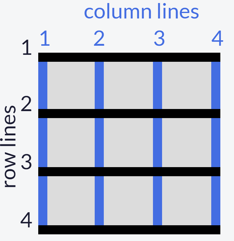
Then we define the structure of the grid; we’ll start with grid-template-columns.
grid-template-columns: 100px 100px 100pxEach unit (we have 3 here) you add is the amount of columns that the grid will entail
The same goes for grid-template-rows.
The values for these row/column templates are, fr (fraction of the remaining row/column; can be any whole number), auto (automatically adjusts to the width/height of the grid), and % (adjusts column/row to the percent width of its container).
You can create a gap between columns with the grid-column-gap. The value is any unit of px.
And once again, the same goes for grid-row-gap.
We also can do an abbreviation of this with grid-gap. You’d only use this if you want to space all the rows/columns. If you put 2 values, it will adjust the rows and columns, in that order.
Using the grid-column element, we can use a fractioned value to make an item extend. So for this task, I used 2/4 to make the item extend from column 2 to column 4. grid-row applies too.
Next we can align an item horizontally (justify-self) and vertically (align-self). The 3 values are: start (left/top), center (middle), and end (right/bottom).
You can also align all items as compared to single ones like we just did. Just replace ‘self’ with ‘items’. The same 3 values still apply.
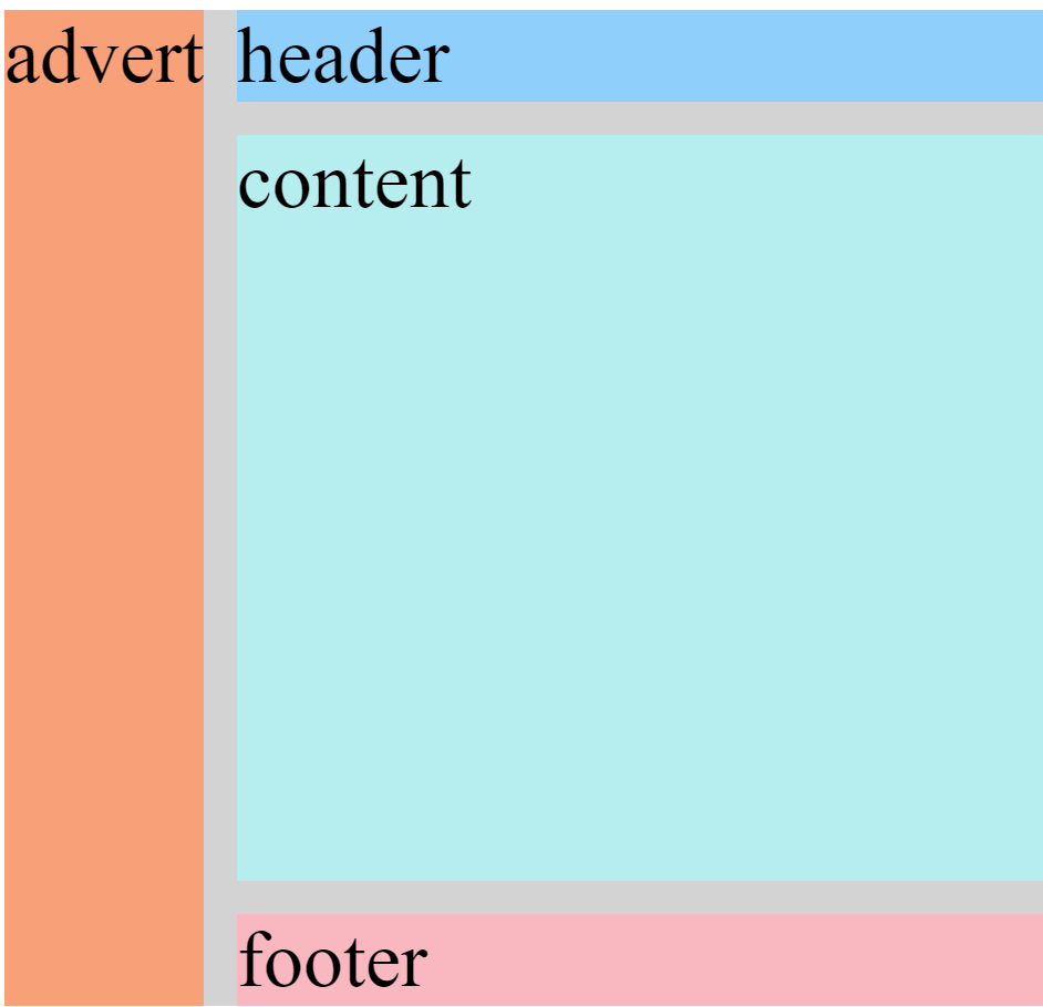
Creating an area template for our grid basically allows us to play with it a little more manually, as compared to doing separate commands for every little thing.
grid-template-areas:
      "header header header"
      "advert content content"
      "footer footer footer";
Based on a 3×3 grid, each of these values represents a box within the grid. So the “header header header” represents the top 3 boxes, “advert” is the middle row’s left while “content content” is the middle row’s middle and right boxes, and “footer footer footer” encapsulates the entire bottom row.
Under whichever class you choose, you can use grid-area to reposition the item into any value. Going off of the above code, if I set the value to footer, the class’s item would then take up the whole bottom row.
In the event there is no area template available, we can use the line numbers alternative:
grid area: A/B/C/DA: horizontal start point/B: vertical start point/C: horizontal end point/D: vertical end point
So if you wanted the item to start from row 1 and end at row 2, and also start from column 3 and end at column 4, you would write it as 1/3/2/4
This whole time we’ve been adjusting a 3×3 grid, as we go on, we’ll see the grids in the real world are way bigger than that. As compared to the grid-templates where we write a unit for each row/column, we can use the repeat function to select multiple rows/columns instead of writing in the unit for each one. This only works if you want the unit to be equal between all selections; it doesn’t work if you want 22px for one and 54px for another.
grid-template-columns: 2fr 2fr 2fr 2fr;

to

grid-template columns: repeat(4, 2fr);
This keeps our code clean from a bunch of redundant units.
To limit items’ sizes when the container changes size
grid-template-columns: repeat(3, 1fr);


to

grid-template-columns: repeat(3, minmax(90px, 1fr));
The units in the ‘minmax’ function are the specified minimum and maximum widths of the column.
Still barely know what I’m doing, we’re almost done.
Adding auto-fill to a repeat function (supposedly) adjusts the items to fit the container to leave space for newer items
Auto-fit on the other hand seems like it only adjusts the items’ sizes to fit the container itself; so I guess this is for when you don’t plan on adding any more.
FINALLY, we can create a grid within a grid. Under your selected class, you first add the display grid property (the first code in this post) and then use either of the templates we went over.
What I Learned Today
- To first define a grid to be able to adjust it
- Define the structure of grid rows/columns (values: fr, auto, %)
- Create a gap between rows/columns
- Extend a grid item using a fractioned value
- Align an item horizontally/vertically
- Align all items horizontally/vertically
- Create a grid area template
- Reposition an item in a grid area
- Use line numbers as an alternative for an absent grid template
- Use the ‘repeat’ function to avoid writing the same unit over & over again
- Limit items’ sizes for when the container changes size with ‘minmax’ function
- Use ‘auto-fit’ and ‘auto-fill’ to adjust items’ size within the container
- Create a grid within a grid
Concerns
For #7: When assigning a value to the grid area, why does only one take up the whole row? Why is it when I only put one ‘footer’, it doesn’t do one box if the template area has 3? Shouldn’t it be like ‘footer footer footer’ if I want the whole row?
Finally done the basics! I’m almost certain that these grids are just a way of manually adjusting site content; basically the technical way of putting together a site compared to drag-and-drop.
Next up I’ll be doing the first project, a tribute page.
 Grant Abraham