CSS (Cascading Style Sheets) is the language used for aesthetic purposes in creating a document, typically paired with HTML. HTML is the coloring book. CSS is your crayons.
We mainly use it for fonts, colors, and graphic borders.
There are 44 tasks. I’d like to finish this today, or at least get 30 done. So let’s get started.
First, we will learn how to change the color of a text.
The first thing we want to do is to take the closing angle bracket > off of the opening tag of the element we want to do.
So let’s say I want to change the color of my header, we’ll use the text “Title” as a placeholder.
Remember, originally, a basic header text would look like:
<h1>Title</h1>If I want to change the color of this header (say to blue) I would do:
<h1 style="color: blue;"Title></h1>See how I removed the closing angle bracket off of the first h1 tag and moved it to the end of the text?
It’s important to mind the colon after color and the semicolon after the name of the color.
I can already see how that would get messy, especially for a flashy page. I prefer to use the CSS selectors
So instead of adding the color within the code, I’ll just wrap the code around a style block.
<style>
<h1 {color: blue;}
</style>
<h1>Title</h1>
This code performs the exact same function as the previous code. This way takes up more lines, but it’ll be easier to look at as the code gets more clunky.
Remember, most code we write isn’t set in stone after we finish. We have to structure it so it is accessible for other programmers to revise.
This next one also does the same thing as the previous two codes. It’s not simpler, so I can’t yet say its purpose besides just seeing it as another alternative.
These are called classes.
<style>
.blue-text {color: blue;}
</style>
<h1 class="blue-text">Title></h1>
Scratch that on me saying I don’t see the purposes of classes. These are better for selecting elements individually, as opposed to the style blocks that would have to go over every element I want colored.
This is a great opportunity to look at how there are multiple ways of writing the same code, yet some are more appropriate than others depending on the programmer’s goals.
If there is only one line I want to be colored, the first code would suffice.
If I want to color multiple blocks of text that are all next to each other (say “heading on line 1, second heading on line 2, and paragraph on line 3”), the second code of style blocks would be appropriate for that.
The last code that I just wrote is for selecting elements individually. If I want to color the elements on lines 2, 4, and 10 without coloring those in between, it would be cleaner if I defined the class first, then just add the class to the lines that need it.
Now, let’s move on to font size. This goes within a style block.
<style>
h1 {font-size: 20px;}
</style>
The ‘px’ (pixels) is the unit for font size, the number before it can be whatever you please. Just like how it is for colors, don’t forget your colon and semicolon.
Here’s font families (or names).
<style>
p{font-family: fontname;}
</style>
You can also pair these elements within the same brackets
<style>
p {font size: 20px;
font-family: fontname;}
</style>
We can import from Google Fonts. You first paste the link at the top of the page:
<link href="fontlink.com" rel="stylesheet" type="text/css">Then do a regular font-family element with the font’s name.
In case a font is unavailable, we can specify a downgrade font (a backup). It’s also good form to comment the imported font right under the element
<style>
p {font-family: GoogleFontName, BackupFontName;}
<!--GoogleFontName-->
</style>
Next is sizing an image.
You first declare the element in the style block:
<style>
.smaller-image {width: 20px;}
</style>
This could also be ‘larger-image’ if you wanted.
Then add the class into the image element right after the alt tag.
<a href="#"><img src="imagelink.jpg" alt=image description" class="smaller-image"</a>Now we’re getting into the more graphic side of coding. First let’s add borders around our image.
‘Thick’ and ‘green’ are the placeholders.
<style>
.thick-green-border {
    border-color: green;
    border-width: 10px;
    border-style: solid;
</style>
We can also add multiple classes within the same element, within the same quotes, all with a simple space.
Compared to our last code, who put the class at the end, we will add it to the beginning of the element right before the src tag.
<a href="#">img class="smaller-image thick-green-border" src="imagelink.jpg" alt=image description"</a>
Personally, I would prefer to put a comma between the classes to keep it clean, but the comma invalidates the code. So we’ll have to pay close attention to those spaces and not get the classes jumbled.
To make our borders a little more boujie, we can give them rounded corners.
For this, we’ll do a simple border-radius class:
<style>
.thick-green-border {
    border-color: green;
    border-width: 10px;
    border-style: solid;
    border-radius: 10px;
</style>
The higher the radius, the more circular it will be. We can also use percentages in place of the px’s.
Next, let’s add a background color to our text. This task in FCC has us adding a silver one to our div element.
So as usual, we first define the class in the style block:
<style>
.silver-background {background-color: silver;}
</style>
Then we add the class into our opening div tag:
<div class="silver-background">
text
text
</div>
By adding this into the opening tag, the class will be applied to everything within the element.
Next we can add id elements. This similarly performs the same function from the 3 ‘color blue’ commands I broke down, which is specifying classes. But the major difference with id elements is they can only be used once.
So after putting an id inside of an element:
id="text-text"We can then declare it in the style element which will change the graphic for us. Let’s say for this example we want to give it a red background
<style>
#text-text {background-color: red;}
</style>
NOTE: Classes are references with . and id’s are references with #.
Now we’re going to take a deeper look into paddings. From this point on, when I say ‘element’ I am speaking of a graphical box like these:
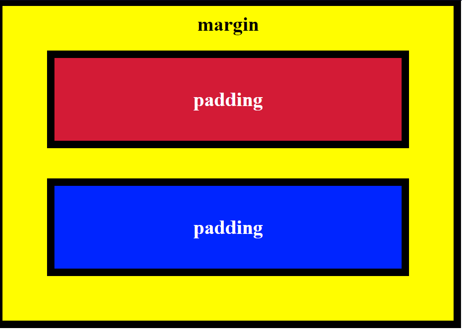
Padding is the size of the box
Borders are the bold black lines around the box
The margin is the amount of space between the boxes
A typical element of this type looks like:
<style>
.blue-box {
background-color: blue;
color: #fff;
padding: 20px;
margin: 20px;
}
</style>
We’ll take a look at the #fff in a bit.
Since the margin represents the space between, you could also make it negative to take away the empty space.
To get a little more intricate, we can also adjust each side of the paddings. The code isn’t anything different.
<style>
.blue-box {
background-color: blue;
color: #fff;
padding-top: 20px;
padding-right: 25px;
padding-bottom: 20px;
padding-left: 25px;
}
</style>
Order of the sides doesn’t matter
The same applies to the sides of margins.
Thankfully, this doesn’t have to be as tedious as writing down each individual side. We can simply put the numbers all inside of one padding or margin element.
<style>
.blue-box {
background-color: blue;
color: #fff;
padding: 20px 40px 40px 20px;
margin: 20px 30px 30px 20px;
}
</style>
While I said that the order of naming the sides doesn’t matter, if you want to use these numbers by themselves, they’re in the order of top-right-bottom-left.
For certain HTML elements (the checkboxes in this example), we can simply use a class selector to style our elements
<style>
[type:'checkbox'] {margin: 15px 5px 20px 5px}
</style>
So this whole time we’ve been using pixels (px) as our units. This is an absolute unit. If you look extra close at a screen, and you see all the little pixels/dots that make up the whole picture, absolute units go strictly off of how many of those pixels it will take up. This varies by the screen size, but for the most part they stay the same.
Now we’re going to start using a relative unit (em) whose sizes are relative to the font size used. If my font size is 10px and I set it inside of a (graphical) element with padding, that padding will squeeze to fit the exact font size.
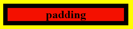
This is an element with no em:
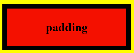
This one has 1em:
And this one has 2em:
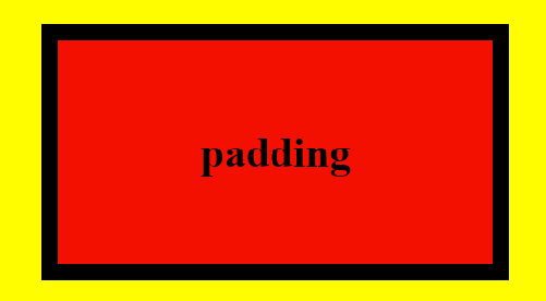
See how the padding doubles relative to the font?
Since we can override styles with classes and id’s, it’s good form to add an !important in the primary style you want shown.
.red-text {color: red !important;} This will ensure that red will be the primary color for the selected element over other colors that may be declared
Instead of using the names of colors, we can get more precise and use the hexadecimal (base-16) code. The hexadecimal number system is based on 16 digits as compared to 10 in our regular decimal system.
So hexadecimal has the regular 0-9 digits, with ABCDEF representing 10-15.
Since we know that black is essentially the absence of color, that means black would be #000000, while white (who’s a mix of all colors) will constrast as #FFFFFF
Outside of the hash followed by 6 digits, there is no extra special way of inputting this code.
<style>
body {background-color: #000000}
</style>
Hexadecimal’s color structure follows RGB (red, green, blue) with each 2 digits representing the color.
So all red would be #FF0000. Or rich purple (shows up as more of a magenta) could be #FF00FF, since it’s red and blue turned to the max.
The six-digit system gives us a possibile 16 million different color combinations. Unless you’re programming something extra artsy, that won’t be necessary. So we can simplify this system with 3 digits, one for each color and 4,000 possible combinations.
An alternative to this system is using the RGB values as it’s own element. The code below shows the command for black and white just like my first example with hexadecimal.
rgb(0, 0, 0) or rgb(255, 255, 255)Coming to a close, we’ll be going over variables.
After looking through forums, I still have no idea how variables are any different from classes, we’ll just go over it for now.
A variable is defined with two dashes in front of the name. For the sake of example, we’ll stick with colors.
<style>
--variable-name: black;
</style>
And of course we can add a fallback color in case the variable’s is unavailable. Just add the color within the element and separate it from the variable with a comma.
Today We Learned How To
- Change text color
- 3 ways to do a style element for various circumstances using classes and selectors
- Set font size
- Adjust font families/names
- Import from GoogleFonts
- Specify a downgrade/backup font
- Resize an image
- Add borders around an image
- Adjust the borders around an image (color, width, style, radius)
- Add background color to a text
- Add an id element
- Adjust padding, border and margin of an element (color & size)
- Use relative units, as compared to absolute
- Specify colors using hexadecimal
- Specify colors using RGB
It was great to get a refresher on all of this. I got exactly what I wanted, to build momentum.
Concerns
Only what sets a variable apart from classes or selectors. I should pick this up in the near future.
See y’all next time.
 Grant Abraham